Laurence J Photography
Brochure


InspireFest
Identity / Print


Dublin City University
Brochure

Experience DCU is a publication which aims to showcase and promote Dublin City University’s strong, active links with academic, research and industry partners both at home and overseas.

Inspiration was drawn from the impressive sculpture that adorns the main entrance to DCU. The scheme was inspired by the Irish proverb ‘Ní neart go cur le chéile’ or ‘there is no strength without unity’. Each glu-lam post signifies the students and staff of DCU. The cover and spreads throughout accentuates this theme. The overall brochure is clean and accessible with a strong typographic emphasis. Printed full colour process on UPM Fine plus spot UV varnish on cover.


Shoots & Roots
Identity

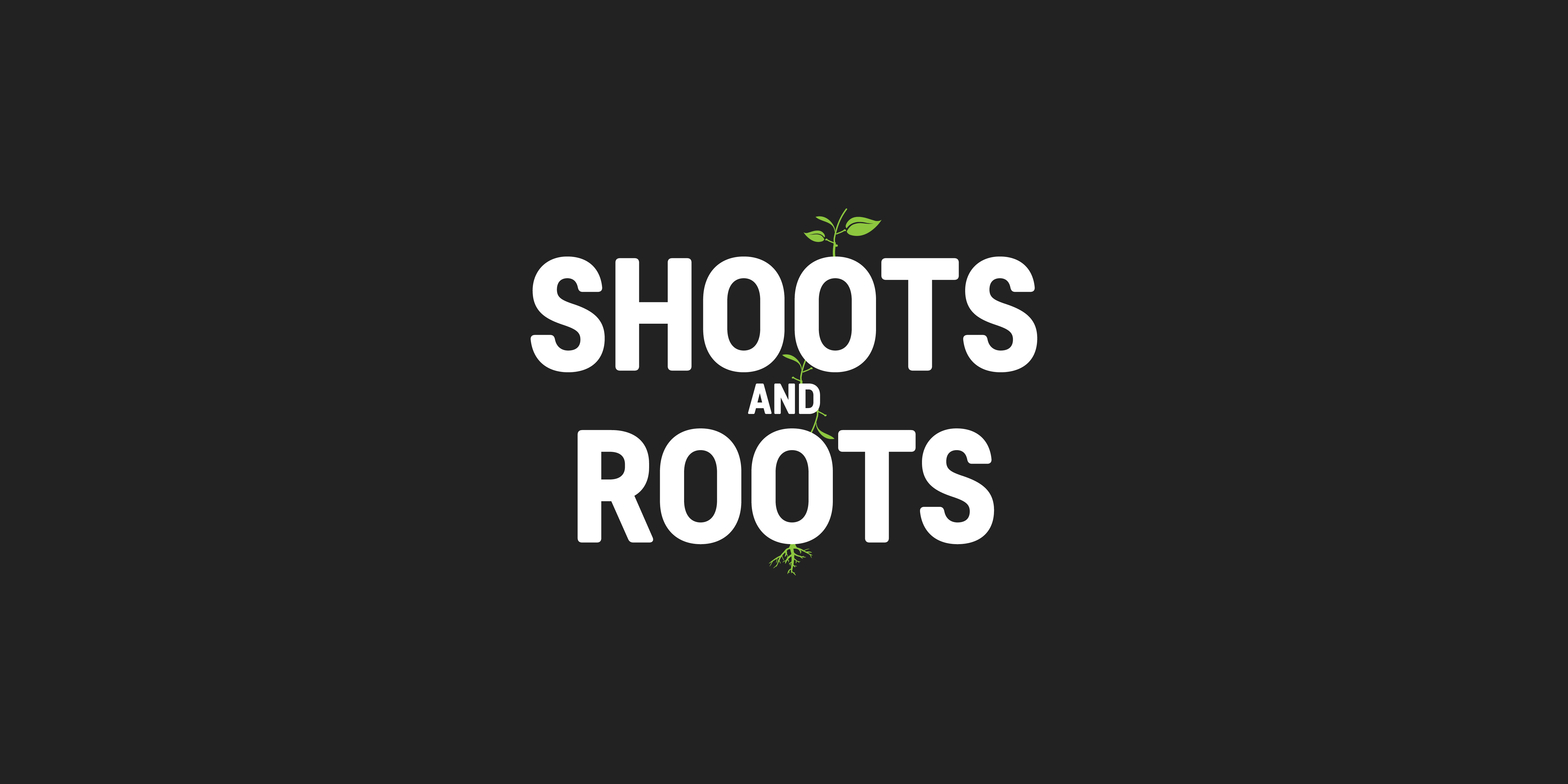
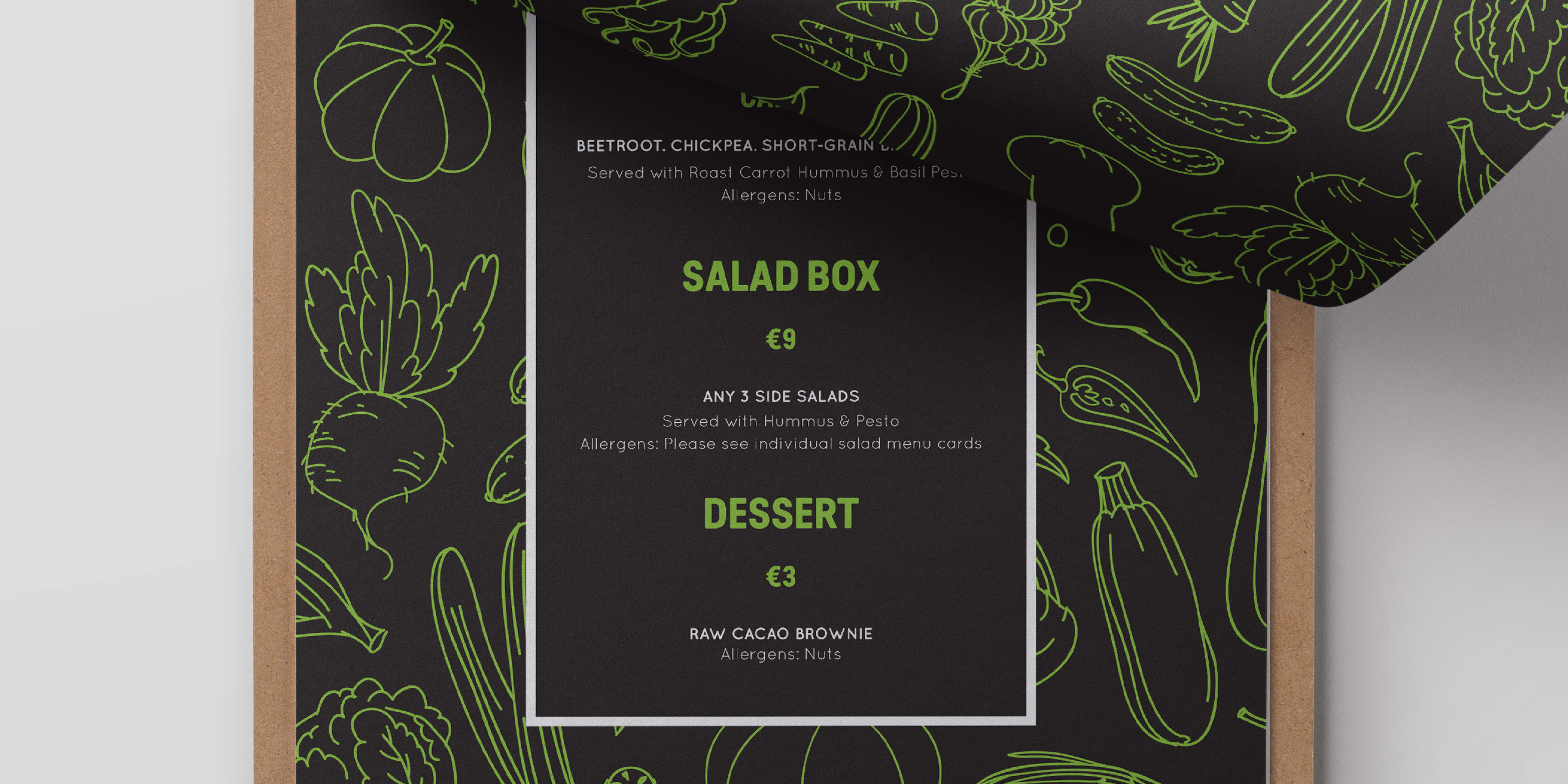
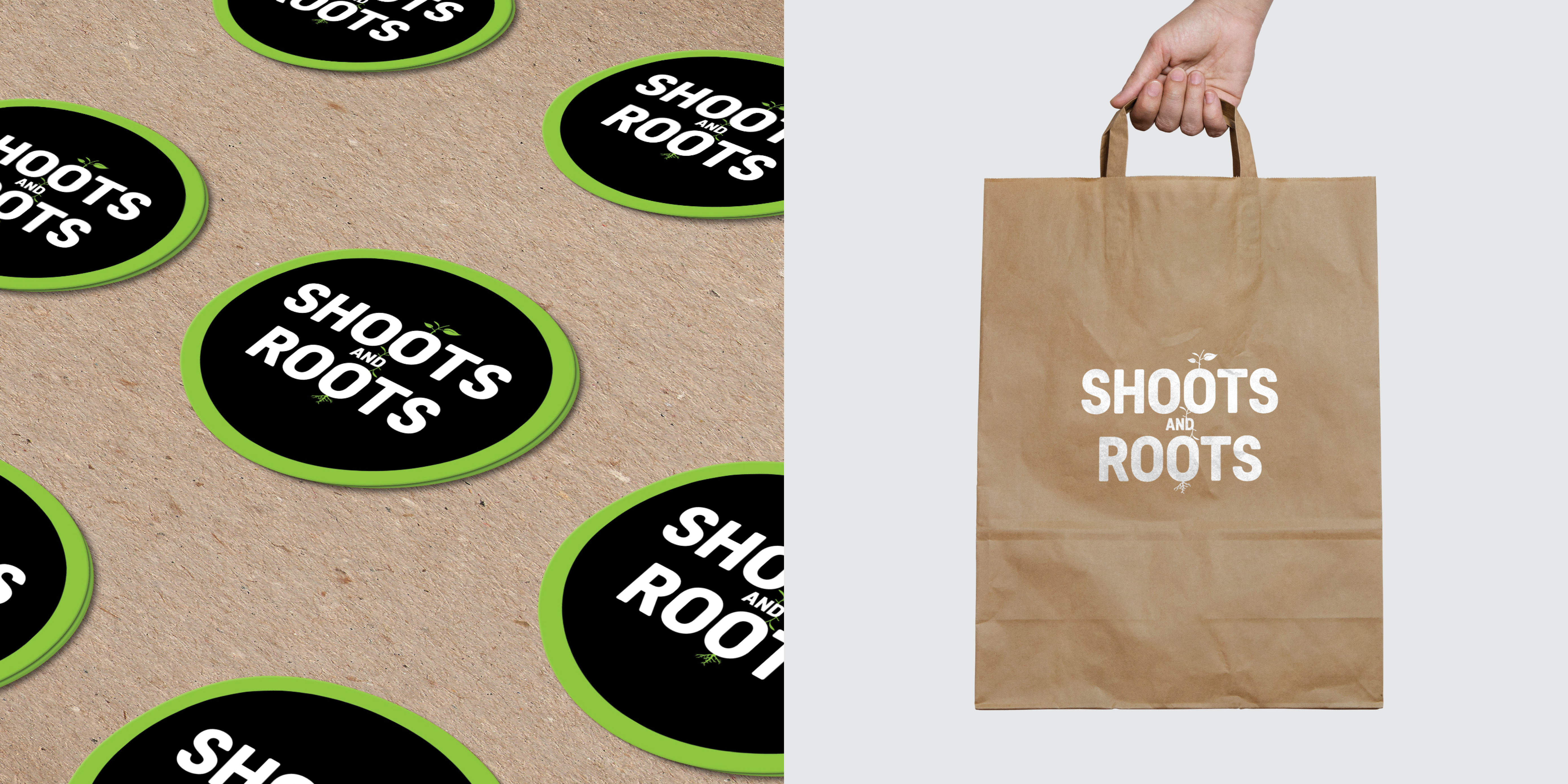
Shoots & Roots are a wholesome vegan food company, trading out of some of Dublin’s best loved food markets. The brief was to design a logo that positioned them as a health conscious plant focused food company, that felt both vibrant and contemporary.

The core idea for the logo was quite literally and simply inspired from their name. The use of green reflects the ‘fresh’ and ‘organic’ plant produce that is sourced locally, while a perfectly neutral black strikes a crisp balance. Predige Rounded was chosen as the typeface - its personality is clear and practical, yet warm and polite, reflecting the brand personality. A collection of icons were created to visualise the core indregients used in their foods.


IRFU
Lansdowne Road Fine Art Drawings Booklet

Prominent Irish Artist, Desmond McCarthy was commissioned by The Irish Rugby Football Union to create a series of drawings to record and capture the atmosphere and history of the oldest international rugby stadium in the world before the demolition of the famous Stands, Clubhouses and Terraces. Created was a simple, effective A5 fold-out format to view Desmond's sketches of the stadium from all angles. Project also included the design of posters and invitations.


Route 33 Barbershop Quartet
Identity / Stationery

The identity centres around four typographic parts that each has its own role representing the four-part vocal chords of the quartet. The lead sings the melody ‘UTE’, the tenor harmonizes above the melody ‘RO’ the bass sings the lowest harmonising notes ‘BARBERSHOP QUARTET, and the baritone completes the chord ‘33’. The project included stationary and a series of posters.


National Museum of Ireland - Decorative Arts & History
Drones and Chanters Exhibition
Identity / Exhibition Poster


Brian Peoples
Identity

Brian Peoples is a Craniosacral Therapist. His design brief was to deliver a simple, modern and uncomplicated logo.

Craniosacral Therapy uses a light touch to mobilise restrictions in the connective tissues surrounding the brain and spinal cord. It is so gentle and slight that it is the best example of the so-called “subtle” therapies. I drew inspiration from this research and applied the same subtle thinking to the resulting monogram - the gentle combination of the “B” and “P”.